I recently went and looked at a listing on 14th and T Street in the U Street neighborhood. I found the posting online and was intrigued by the pictures. Luckily there was an open house on Saturday. On my way to brunch, I popped in to get a better feel for the place.
The studio is located in a small condominium building right next to Taqueria National. The lobby floor has beautiful mosaic tiling and the unit is only a short walk up one flight of stairs.
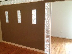
What I was most excited to see was a wall. It sounds silly but until yesterday, I had never seen this kind of construction in a studio in DC. Here is what the wall looks like from the living space:
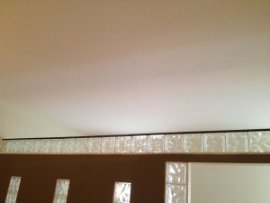
Constructing this wall was a good idea in theory because it gives some division between the living and sleeping area. However, I was not crazy about the glass blocks. I felt like it didn’t really go with the rest of the apartment. I also didn’t like that the wall was painted a different color. It made the addition feel obvious. But then I looked up:
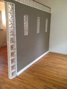
The wall is a few feet shorter than the ceiling. Once I noticed this, it all came together. The height of the wall and the glass blocks are all tricks to let in the natural light from the sleeping area. Here is the view from the sleeping area:
I realized that this wall was actually quite clever and served two purposes. It creates division and captures natural light. In an ideal world the spaces would be swapped. Direct natural light is much more important in a living space than in a sleeping area. I would also consider changing the wall color. Lightening up the walls will make the rooms feel brighter.
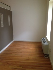
It’s hard to believe that so much thought went into maximizing the light from this one little window, but in small spaces you have to capitalize on what you have.
Love this place? It could be yours!
Click here to see the original listing and schedule a viewing.


